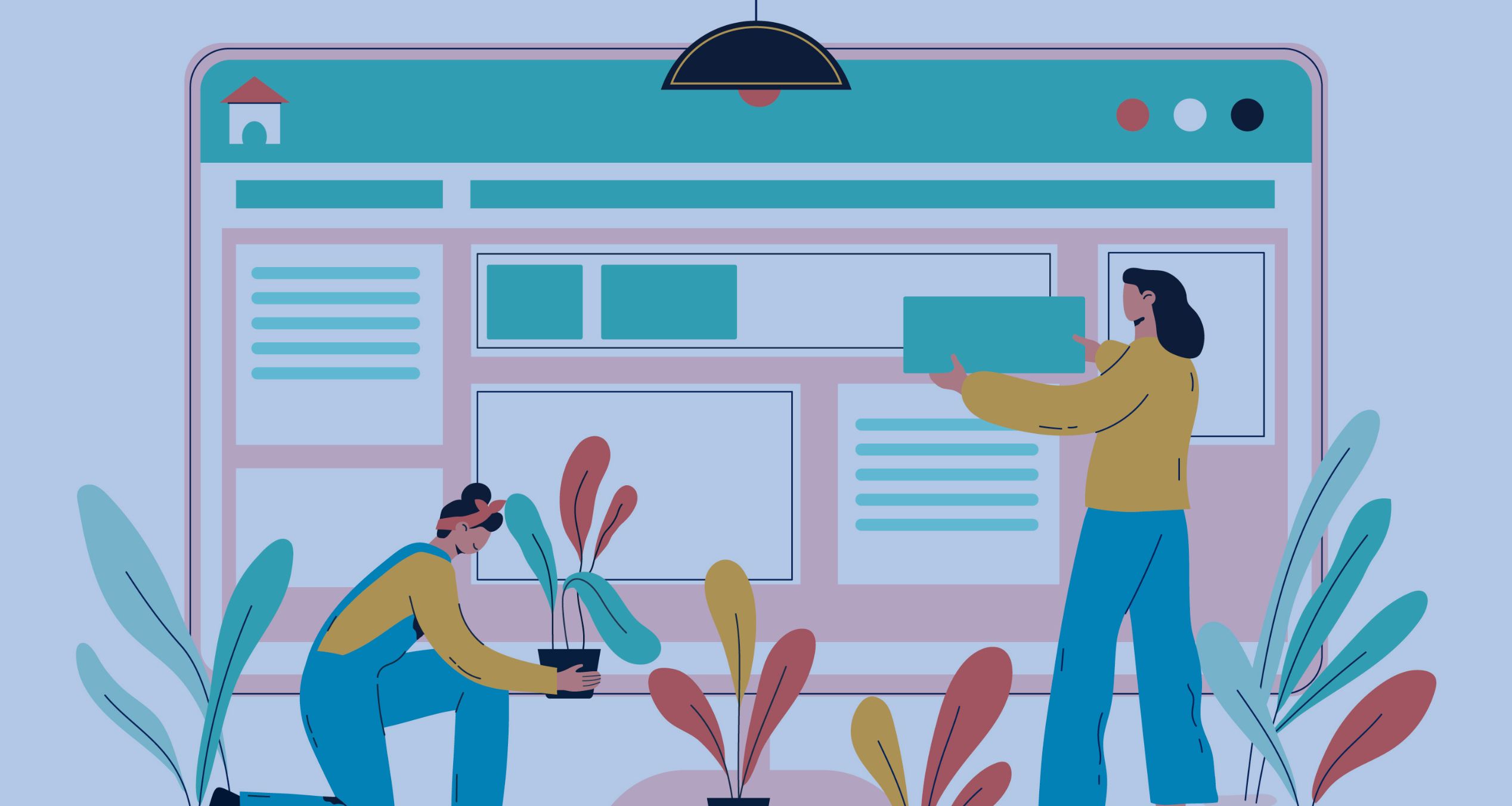
'Pretty' design or design that converts?
The myth of aesthetics in wellness marketing. Learn to prioritize functionality and contrast over beauty in your landing page design and boost your conversion optimization today.
Interview multiple candidates
Lorem ipsum dolor sit amet, consectetur adipiscing elit proin mi pellentesque lorem turpis feugiat non sed sed sed aliquam lectus sodales gravida turpis maassa odio faucibus accumsan turpis nulla tellus purus ut cursus lorem in pellentesque risus turpis eget quam eu nunc sed diam.
Search for the right experience
Lorem ipsum dolor sit amet, consectetur adipiscing elit proin mi pellentesque lorem turpis feugiat non sed sed sed aliquam lectus sodales gravida turpis maassa odio.
- Lorem ipsum dolor sit amet, consectetur adipiscing elit.
- Porttitor nibh est vulputate vitae sem vitae.
- Netus vestibulum dignissim scelerisque vitae.
- Amet tellus nisl risus lorem vulputate velit eget.

Ask for past work examples & results
Lorem ipsum dolor sit amet, consectetur adipiscing elit consectetur in proin mattis enim posuere maecenas non magna mauris, feugiat montes, porttitor eget nulla id.
- Lorem ipsum dolor sit amet, consectetur adipiscing elit.
- Netus vestibulum dignissim scelerisque vitae.
- Porttitor nibh est vulputate vitae sem vitae.
- Amet tellus nisl risus lorem vulputate velit eget.
Vet candidates & ask for past references before hiring
Lorem ipsum dolor sit amet, consectetur adipiscing elit ut suspendisse convallis enim tincidunt nunc condimentum facilisi accumsan tempor donec dolor malesuada vestibulum in sed sed morbi accumsan tristique turpis vivamus non velit euismod.
“Lorem ipsum dolor sit amet, consectetur adipiscing elit nunc gravida purus urna, ipsum eu morbi in enim”
Once you hire them, give them access for all tools & resources for success
Lorem ipsum dolor sit amet, consectetur adipiscing elit ut suspendisse convallis enim tincidunt nunc condimentum facilisi accumsan tempor donec dolor malesuada vestibulum in sed sed morbi accumsan tristique turpis vivamus non velit euismod.
If you're on the path to selling your wellness or health services online—whether it’s a membership, a course, or a coaching program—you know there's a moment of panic: the landing page.
You sit down in front of your screen, and the big question hits you: How pretty does my landing page need to be for people to actually buy?
It's a legitimate question. We've all seen those impeccable websites with designs that look like they're straight out of a digital architecture magazine, perfectly coordinated colors, and photos worthy of Pinterest. And the logic tells you: "If my page is that pretty, it will generate trust, and therefore, it will sell."
And yes, in part, the logic is right. But in the world of health & wellbeing the formula is more complex. If aesthetics were the most important variable, every graphic designer would be a millionaire just by making pretty pages. All pretty landings would convert, and we know that's not the case.
The real work is not in beauty, but in strategy. Today, we're going to debunk that myth so you stop wasting time and money chasing visual perfection and start focusing on what really brings you clients and fills your schedule.
The fallacy of perfection: why beauty fails
In my sessions, I often notice that wellness professionals are naturally perfectionists. This is great for their therapeutic practice, but it can be a death trap for their landing page design.
The problem is that they confuse design with conversion.
- Design is about art, colors, typography, and composition.
- Conversion is about psychology, clarity, urgency, and message alignment.
If your landing page is incredibly beautiful but doesn't answer these three questions in the first 5 seconds, people will leave, no matter how elegant it looks:
- What is this? (Is it a course? A consultation? A webinar?)
- Who is it for? (Is it for me? Women? Men? Entrepreneurs?)
- What do I gain if I stay? (What problem does it solve? Will it give me more energy? Will it take away my anxiety?)
If you have an incredible design but a vague message, you're putting a luxury wrapper on an empty gift. The client will be frustrated because they don't understand the real value they'll get.
The focus should never be on "pretty," but on functionality. Conversion Optimization is a high-performance sport where every element must have a clear purpose. If a color or image doesn't help people better understand the offer or click the button, it's unnecessary.
The non-negotiable fundamentals of conversion (structure is king)
Before talking about aesthetics, let's talk about the conversion pillars on your landing page. These elements are the foundation, the base of your building. If they fail, the building falls, even if it's painted gold.
1. Page load speed (the impatient client)
In the wellness world, people are looking for relief, and they're looking for it now. If your page takes more than 3 seconds to load on a mobile phone (and remember, almost all ad traffic comes from mobile), you've lost a significant percentage of your potential clients.
This is a trust factor. A slow page feels neglected, outdated, or, worse, insecure.
Conversion SEO tip: Use optimized images and light files. A beautiful design with high-resolution stock photos slows down your page and steals conversions. Prioritize speed over the crispness of the smiling model's stock photo.
2. Immediate clarity of the headline
This is the job of the copywriter, not the designer. The headline must be a clear promise that solves your client's problem.
- Poor functional design: A pretty but vague headline. (Ex: "Find inner peace through your guide.")
- Good functional design: A headline with contrast and promise. (Ex: "Stop Feeling Guilty About Rest: The 4-Week Program for Female Leaders Who Want More Energy Without Sacrificing Their Career.")
Converting design ensures this headline is read. Use a large font size, a color that contrasts perfectly with the background (black on white works!), and a clear heading (H1 for SEO). Design here is the tool that underscores the promise.
3. The contrast of the call-to-action (CTA) button
If there's one place where design is vital, it's the Call-to-Action (CTA) button. This button should be screaming: "Click Here!"
The most common design mistake is making the button aesthetically "blend in" with the rest of the page. If your landing is mint green, your button cannot be mint green.
- Use contrasting colors: If your main palette is blue and white, use a bright orange, a strong yellow, or a red for your button. Functional design demands that the user's eye goes straight to that action.
- Use action verbs: The text shouldn't be "Buy Now" if it's a free webinar. It should be: "I Want My Free Guide," "Register for the Workshop," or "Book My Strategy Call."
Converting design doesn't aim to be pretty; it aims to be easy to use.
Design as 'extra improvement percentage' (trust signals)
Now, let's talk about aesthetics, but with a new mindset. Design doesn't give you the base conversion, but it does give you those "extra improvement percentages" that differentiate you from the competition. Good design is a sign of confidence.
Imagine two landing pages identical in message and offer:
- Page A: Loads fast, clear headline, but looks like it was made in 1998 (basic design, ugly colors, blurry photos).
- Page B: Loads fast, clear headline, but uses modern typography, has a high-quality photo of you (professional, not stock), and a clean background.
Page B will convert better. Why? Because people unconsciously associate the professionalism of the design with the professionalism of your service. If you take the time to make a polished page, you're more likely to take the time to give your clients a good service.
Design elements that add trust:
- Your professional photo (headshot): Don't use a stock photo. Use a photo of yourself that conveys empathy and professionalism and is consistent with your brand. Your client is buying your expertise.
- Testimonials and logos: Visually ordered and with the client's logo or the person's photo. Design here gives weight and legitimacy to social proof.
- White space: Converting design breathes. If you cram a lot of text and images together, you overwhelm the user. The intelligent use of white space is a sign of sophistication and helps the eye focus on what's important.
The myth: Pretty design gets you the sale. The truth: Professional design gives you the credibility needed for the sale to happen if the message has already done 80% of the work.
Conclusion: focus on the promise, not the pixel
If you're about to launch your next wellness service, my advice is: invest 80% of your time in your message and 20% in the design.
- Guarantee the fundamentals: Make sure your page loads fast and your headline is unmistakable.
- Use design as an anchor: Use design so that important information (titles, benefits, the payment button) stands out and is easy to digest. Professional design helps communicate that your service has high value.
- Test, test, test: Let your data, not your personal taste, decide. The page that gives you the most clients is, by definition, the most successful page.
Remember: people don't buy your design; they buy the transformation you offer them. Make the design work for your message, not the other way around.


Related posts


Subscribe to my newsletter


